Designing An Effective Logo
A logo always seems like an easy thing to do for any designer. However, although a good logo may be simple in its construction, it’s not in it's concept. Behind every professional logo there are many hours of research, sketching and testing. Understanding the process behind a logo design can help small business owners to know:
- what makes a good logo and what doesn’t
- what to expect from your designer when they design a logo for your business
I’ve been recently working on a logo design for a new business in Perth, WA Mortgage Advice (website coming soon) and I thought this work could be a perfect opportunity to take you through my logo design process.
My logo design process has five stages:
1. Discovery
The first step of any design work is getting as much information as possible about the client’s business. This information can be obtained through a conversation with the client, through a design brief questionnaire and by researching their market.
By way of example, my latest client is a mortgage broking business, a completely unfamiliar professional field for me. Learning as much as possible about my client’s business was my first mission. To do this I first held a one-to-one meeting with my client.
During the meeting I gave my client a list of descriptive words to select the three that best describe the business personality and core values. My client used words like trust, knowledge and honesty that would give me some clues of what design elements I should consider to visually describe this business.
I get the information I need from a few carefully crafted questions in my design brief questionnaire. This questionnaire helps structure my meetings and formalise the information gathered in a document. When I cannot meet the client face-to-face, I send the questionnaire by email. I could skip the meeting if necessary, but I cannot skip the design brief questionnaire.
A good brief cannot just rely on the information obtained from the client; you also need to research their market. This is always a good chance for me to do visual research, reviewing logo designs of my client’s competitors and seeing how their brands look.
2. Sketching
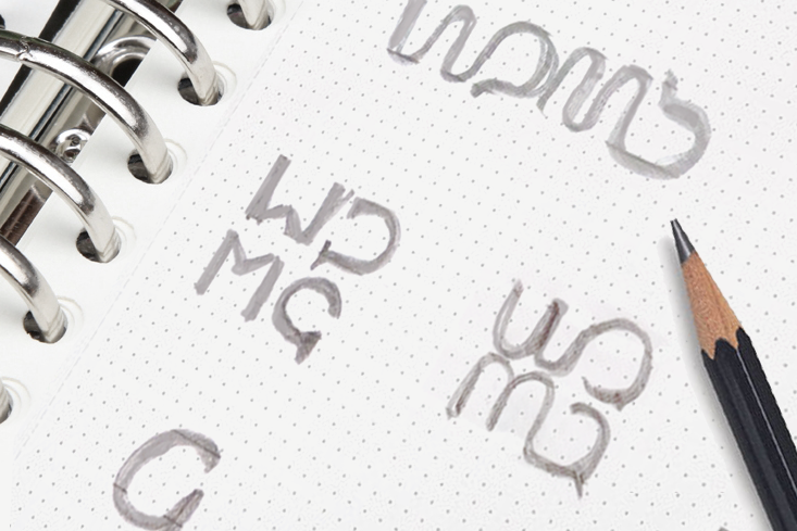
During this phase I sketch dozens and dozens of logos. I start conceptualising the business in a few simple ideas, then I play with the business name or the acronyms, and mix ideas and concepts with letters and shapes.
When someone talks about “mortgage broking” you immediately think of homes, banks, and approval processes. But my client highlighted ideas like offering guidance and giving clarity, security and confidence to people to make lifetime decisions. Listening and understanding clients to give this advice was one of the core values of this business, what gave me the idea of using speech bubbles in one of my logo designs.
3. Designing
After a few hours sketching concepts, I eventually picked the three best concepts that I came up with and drew them in Illustrator. Why only three concepts after sketching dozens of them? Because something I learned about clients is that the more ideas you present the more difficult is for them to make decisions.
At this stage I don’t add colours or anything else just yet. I present the logos to the client in black and white to focus on the concept rather than on the style.
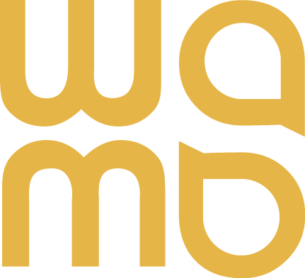
Here are the three concepts presented to this particular client:
4. Polishing
This is my favourite part: the client picked the concept, so now I could go back to Illustrator and refine my logo design. I measured every distance; made every size proportional and every angle identical.
5. Development
Now that the logo is finalised I can complete the entire visual identity with colours, fonts, logo variations, etc. To do these final selections I can go back to my design brief and use the descriptors that the client gave me.
For WA Mortgage Advice I picked a light orange as the primary colour. The client highlighted the importance to communicate a very genuine intention of helping people in the best professional way. According to studies on the emotional meaning of colours, orange is the most suitable colour to communicate friendliness and client care. Orange also would give the brand a modern, young and energetic edge.
During the development phase it's important to test the logo in different media. To do this I create a few mock-ups of business stationary, advertising or other marketing materials that the client may produce in the future. This way I can see how the logo will look and whether it's necessary to make any final changes.
The objective of my design process is to ensure my logos always meet the five principles of any logo design: simplicity, memorability, versatility, timelessness and appropriation.
Now, that you know the different steps involve in a professional logo design and what makes an effective logo, you can put your own logo under test.
Is your logo right for your business?
1. Is your logo simple?
Good logos are uncomplicated. The more detail a logo has, the more information the viewer has to process and retain. Simplicity will make a logo easy to recognise and to remember.
As explained in stage 3 (Sketching) I design my logos just with a pencil first, in black and white, to ensure effectiveness in its simplest form. Colour should be left to the end of the design process.
2. Is your logo memorable?
A good logo is easy to describe. What's difficult to describe, is also difficult to remember. Recognition brings familiarity, which assists in building trust and loyalty in your brand.
3. Is your logo versatile?
As I mentioned in stage 5 (Development) a well-design logo will translate well across different mediums. When printed in small sizes, a complex design will lose detail, making it harder to recognise. A good logo must be simple in order to reproduce well on small scales, such as favicons.
For this reason, logos should be always designed in vector format, that is Adobe Illustrator, never Photoshop.
4. Is your logo timeless?
An effective logo should endure the test of time. A good logo designer doesn’t follow any design trend. Trends come and go and ultimately turn into cliches.
5. Is your logo appropriate?
A good logo design will be relevant to your industry, clientele and target market. Even though your logo doesn’t have to describe what your company does, it has to reflect your business essence and values (as I illustrated in stage 3, Sketching).
Sources:
- Logo Bird, The Principles Of Good Logo Design
- Smashing Magazine, 10 Common Mistakes In Logo Design











The revamping of the Oh Flossy play make-up boxes came with a clear brief to create attractive and engaging packaging designs to capture the attention of children as well as their parents. The project goals were well-defined and the result would delight customers and pour great reviews.