Project highlights
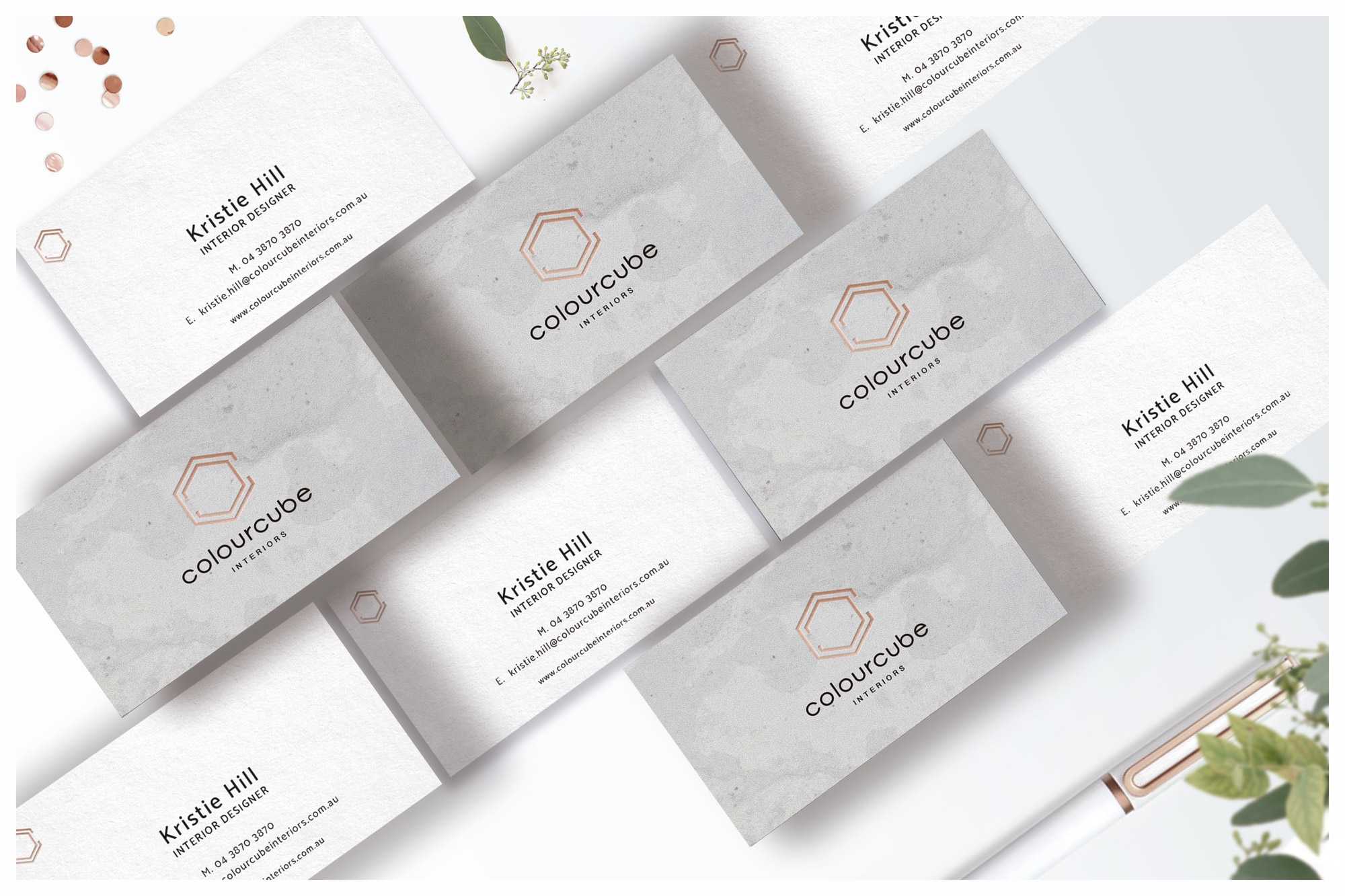
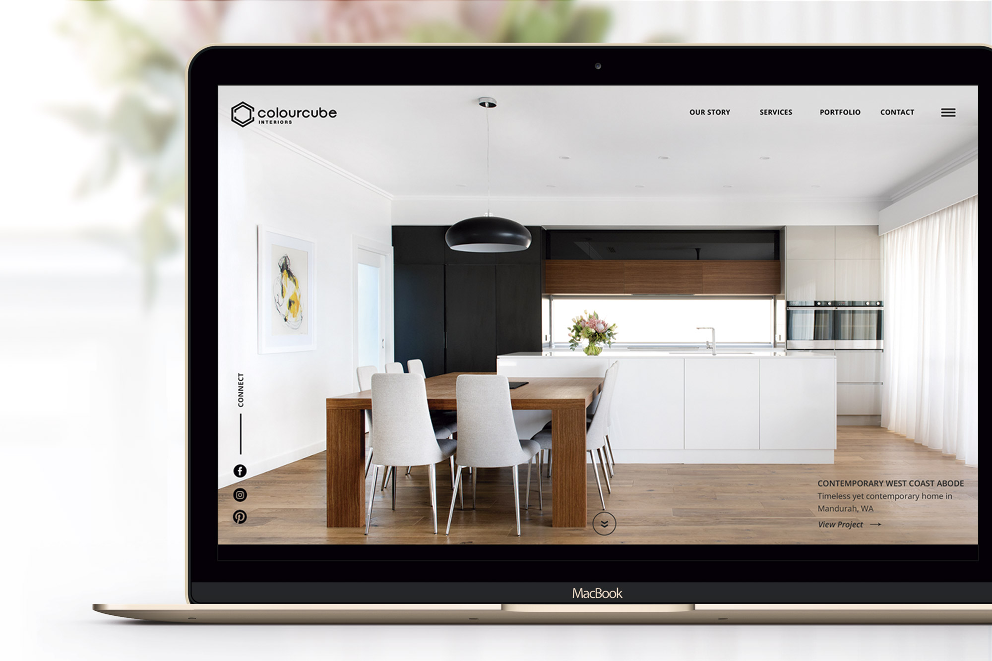
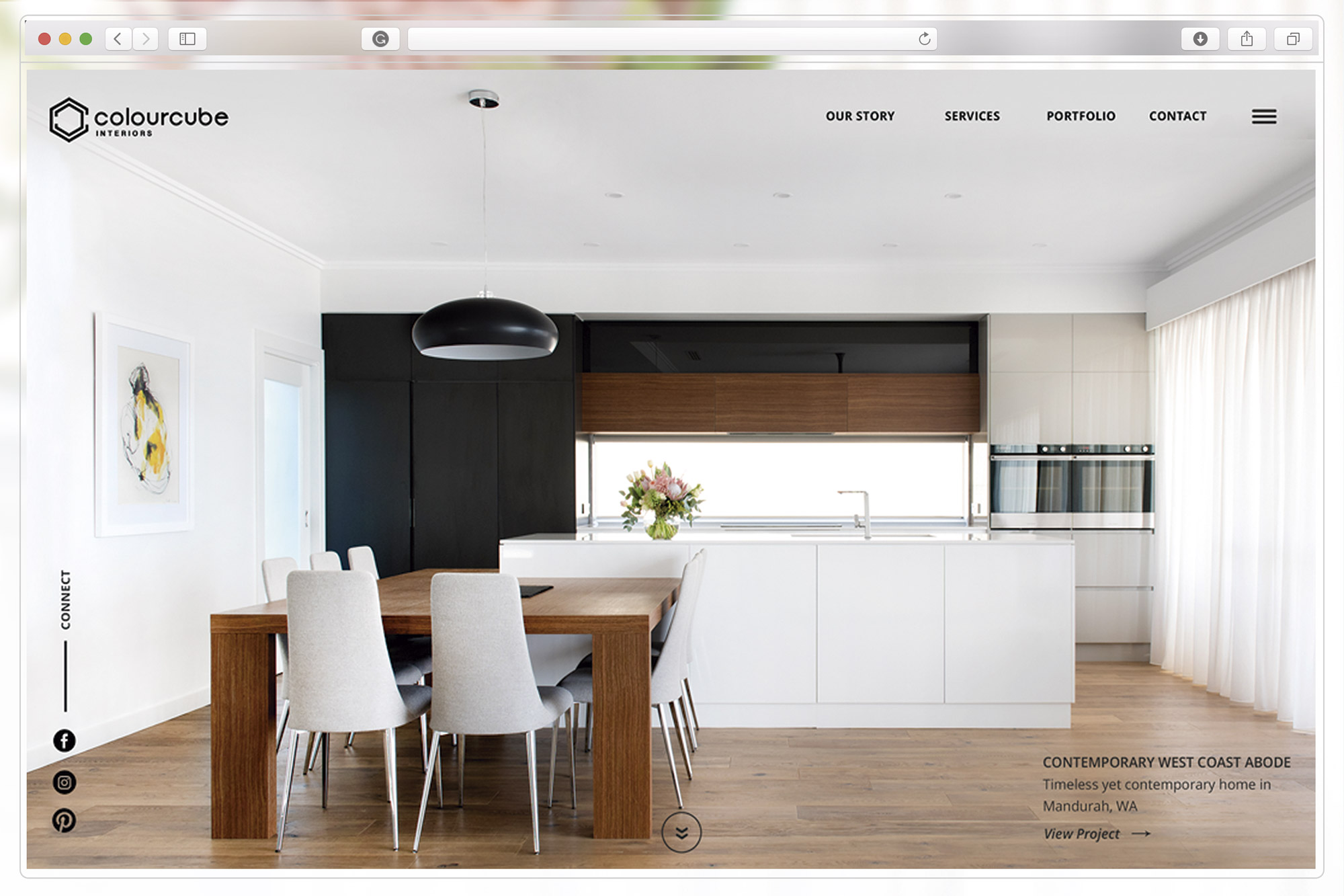
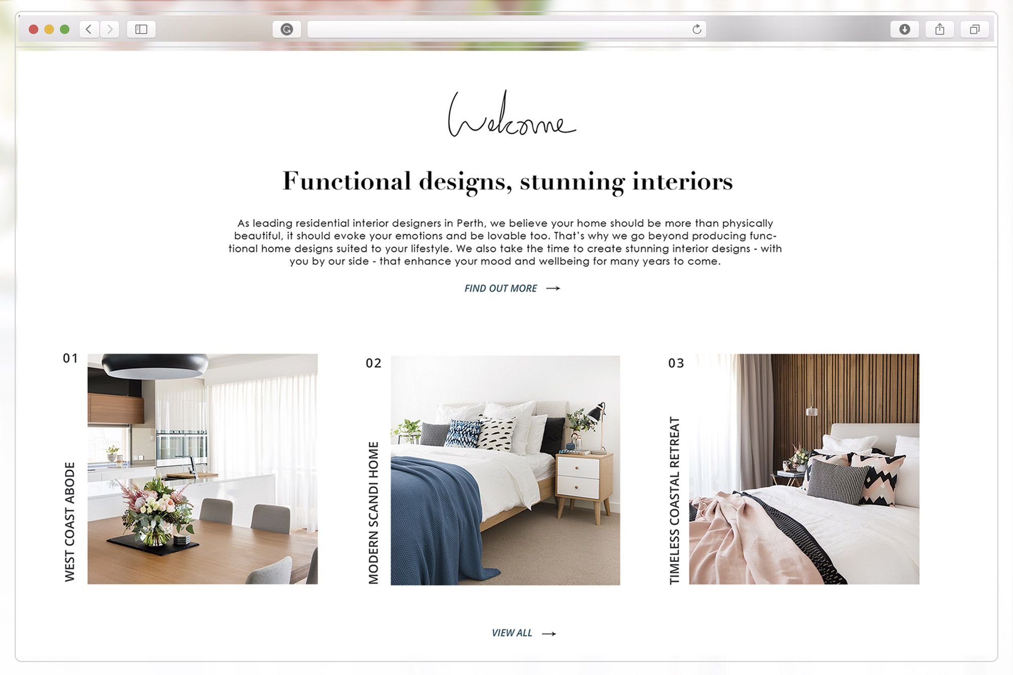
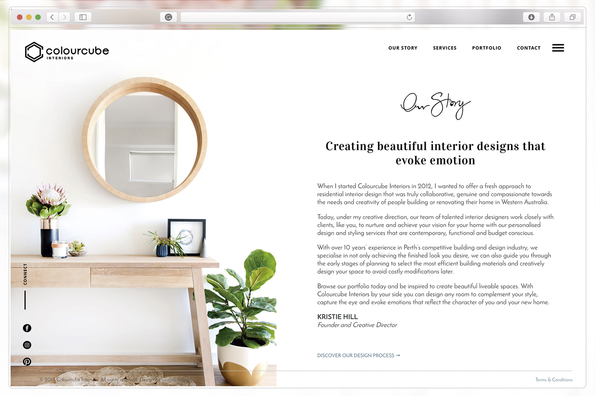
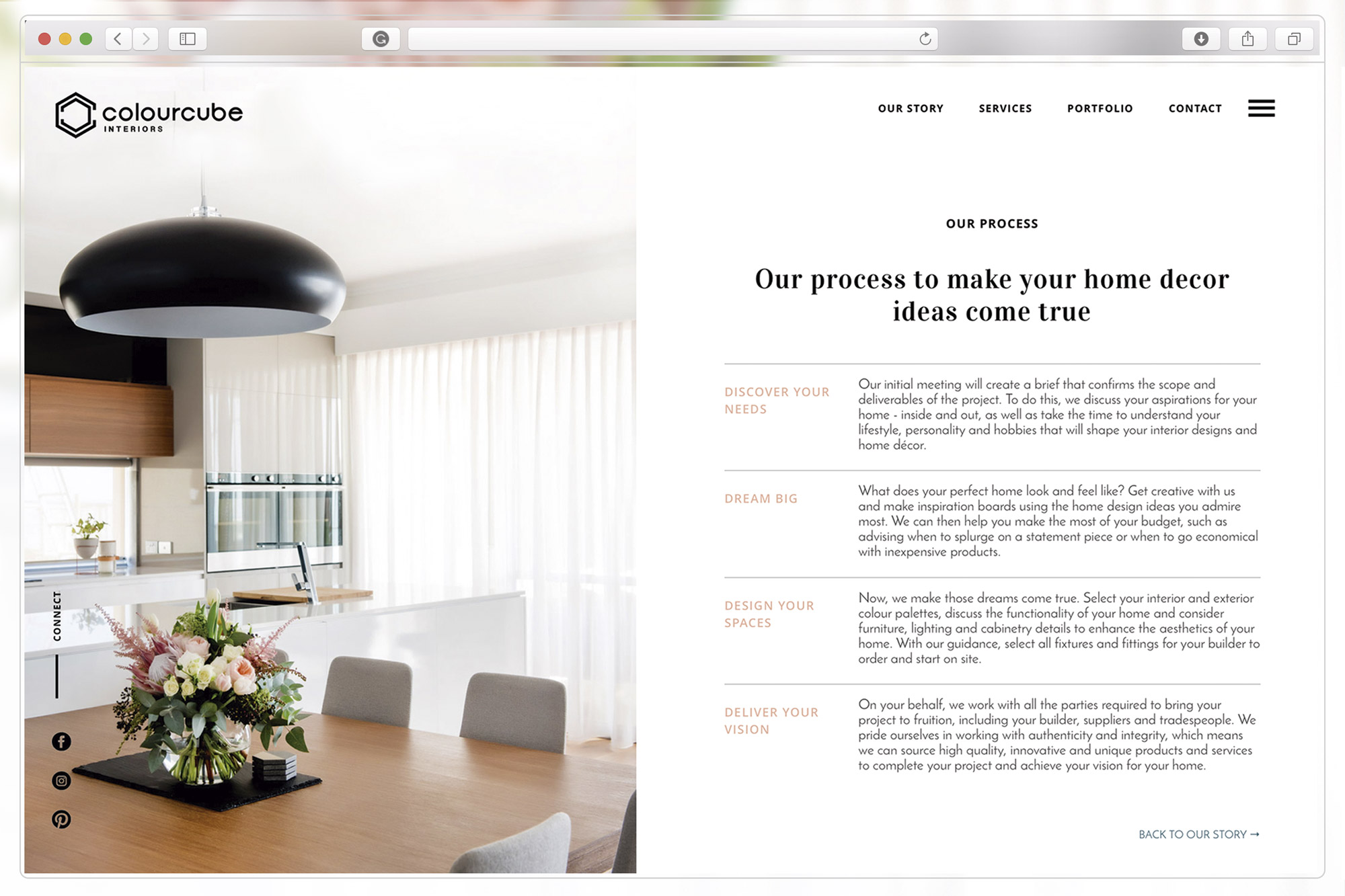
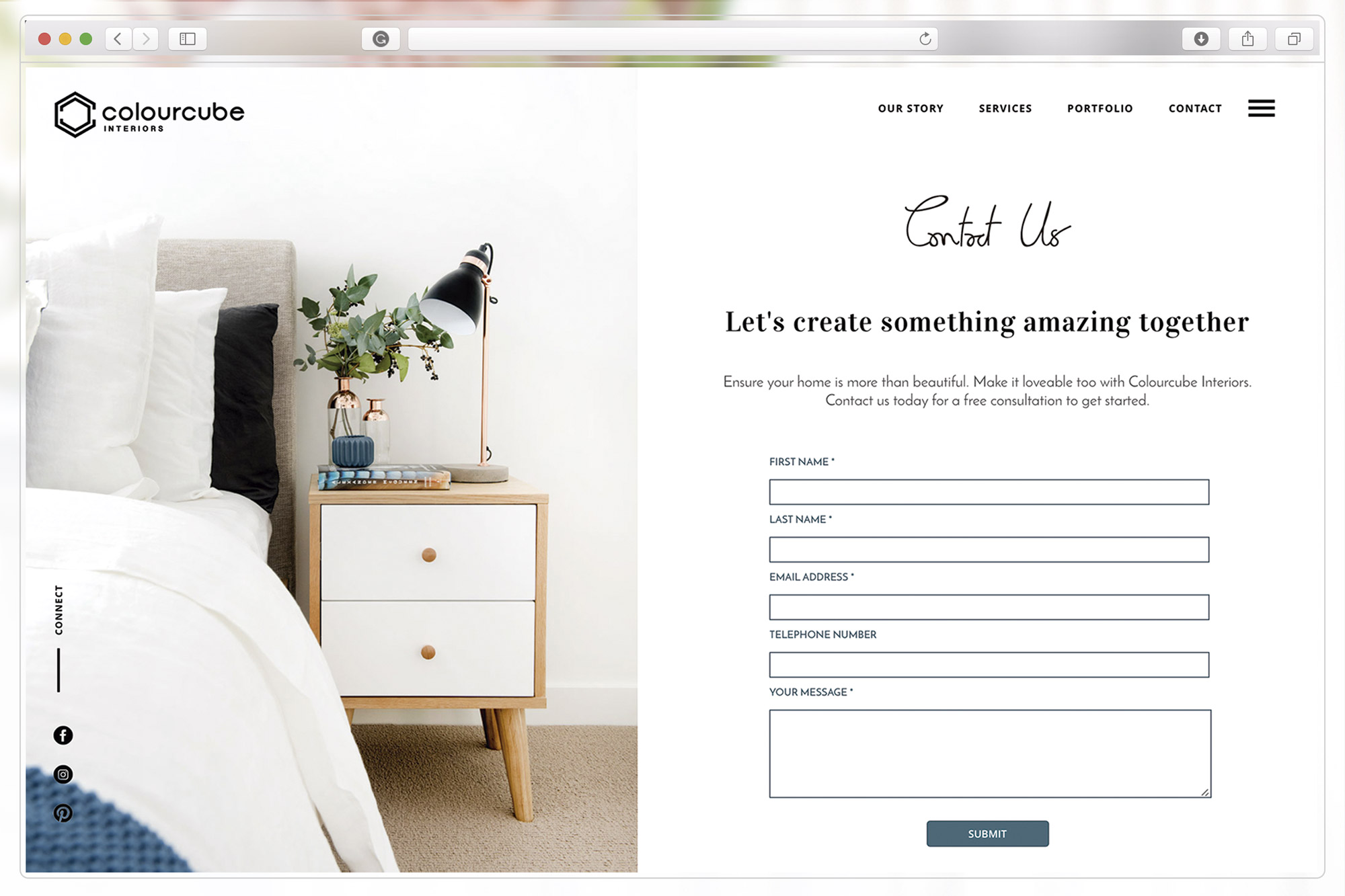
A minimal geometrical logo, a textural brand with a rose gold finish and a clean modern website are the highlights of this project.
The brief was to create a modern brand with a relaxed, natural, textural feel and a hint of luxe.
The logo plays with two open hexagons - to reference the 'cube' - and two 'Cs' for 'Colour' and 'Cube', one inside the other. It was designed to almost look like a piece of jewelry that you could wear. It's simple in its shape, easy to recognise and quick to remember.
The website was also designed with a minimal clean and modern look & feel, without too many graphic elements that distract the attention from the beautiful photography by Perth photographer Claire McFerran of Gathering Light.
Find out more about the creative process behind this brand in this article, and take a closer look to the website design process in this other article, both on my blog.
About this project
Project:
- Logo design
- Business stationary
- Website design and development
Client profile: Perth-based interior designer
Industry: Interior Design
“I can’t believe it. I really actually can’t believe how amazing my new website is. The creative team behind the scenes really has captured what my business, my core values and what I am truly passionate about. A huge thank you to Grafika Studio for the web design. Amazing woman, just had her 2nd baby and still working hard to finish this off for me.
”
