Collected Interiors
www.collectedinteriors.com.au
Project highlights
The brief was to create a sleek and modern new website, to display bigger images and to incorporate some interactive tools. I created a custom-made design – no templates were used here – carefully thought to let the images shine.
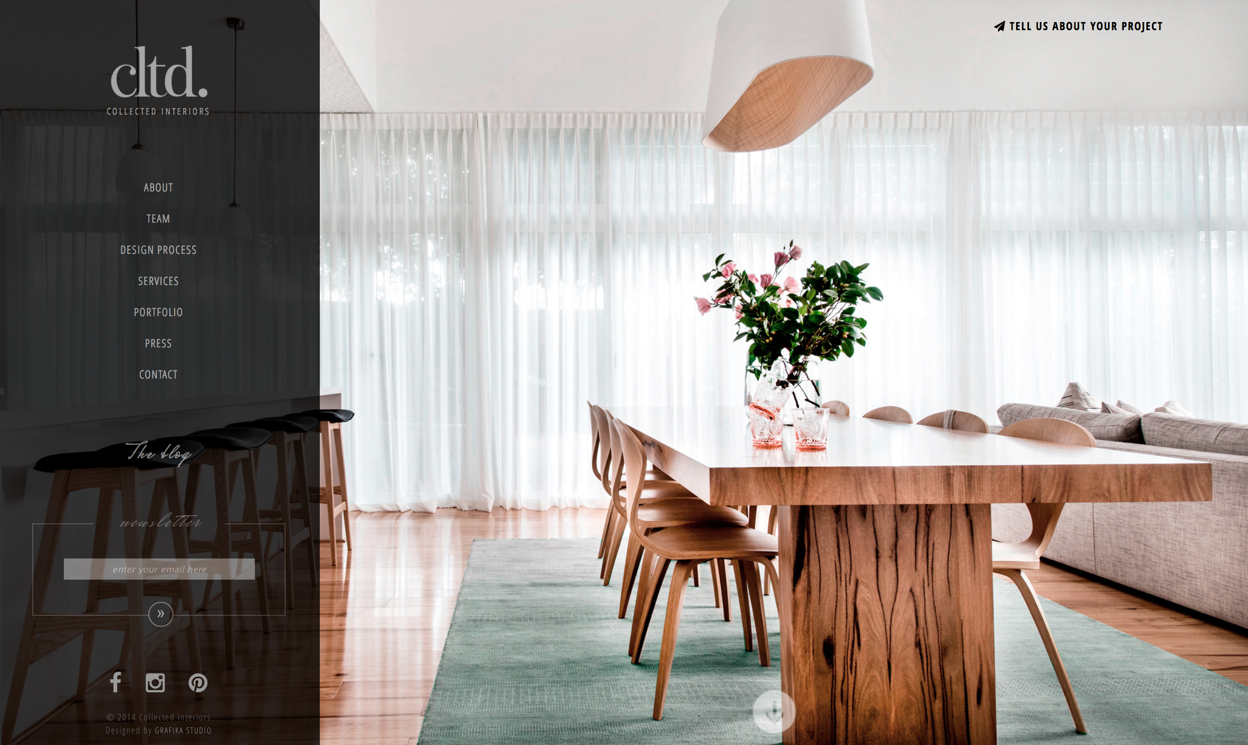
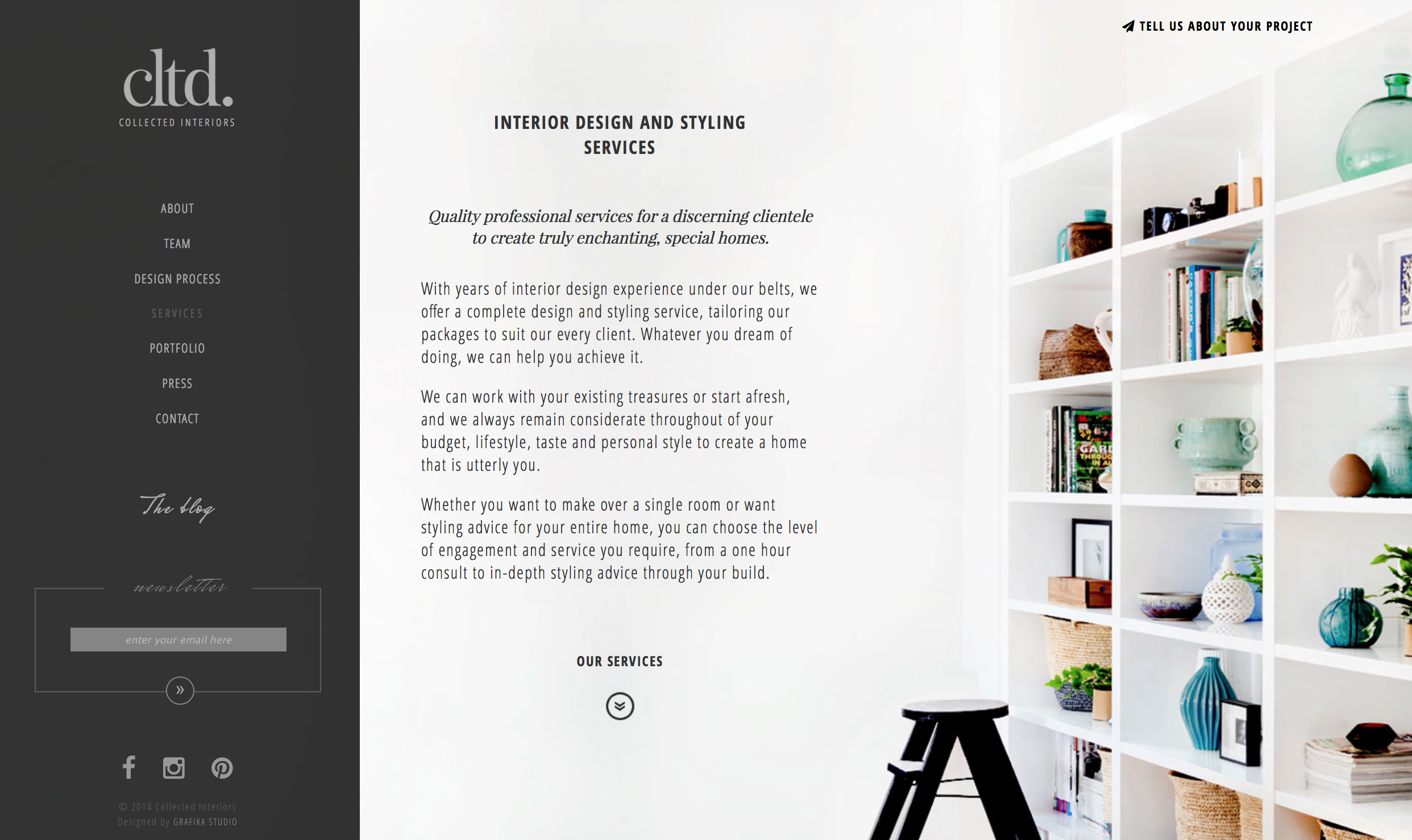
Full screen images in almost every page allow the visitor to get a taste of the designers' talent before even visiting their portfolio. The design is simple and clean so that visitors can enjoy the beautiful photographs with no distractions.
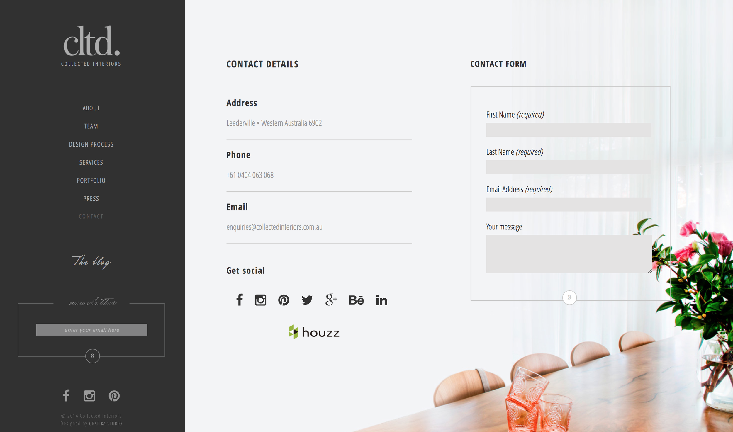
Condense typography, combined with serif fonts for a classy elegant touch, and a lot of white empty space achieve a modern and professional look & feel.
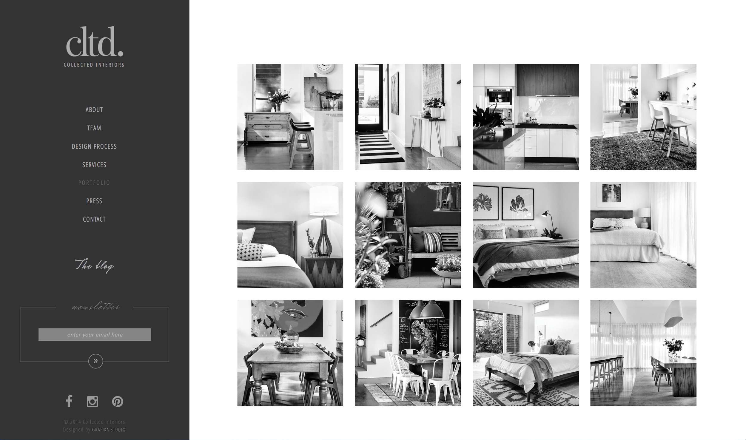
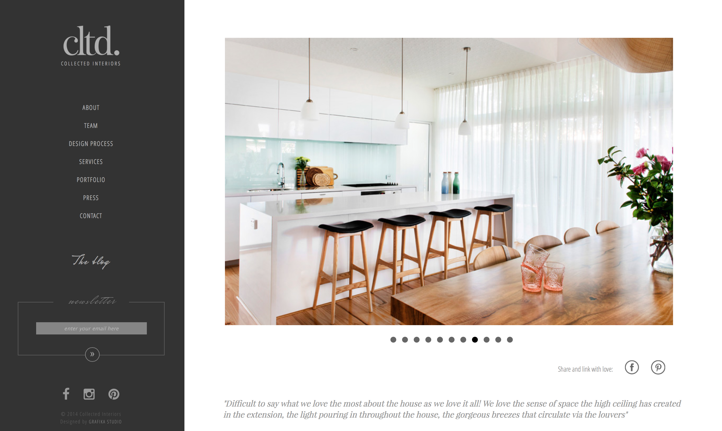
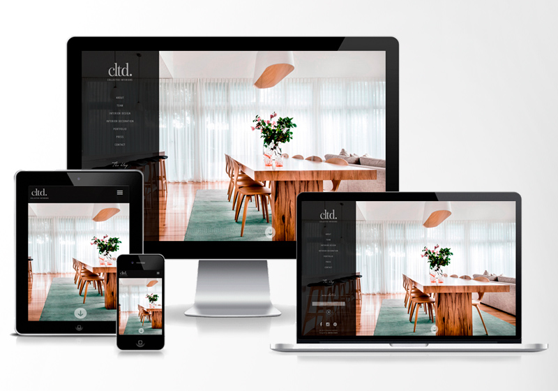
One of the major improvements made on this website was the responsive layout. The portfolio pages have a responsive slider with an advanced touch / swipe support built-in to facilitate the navigation from image to image on small devices.
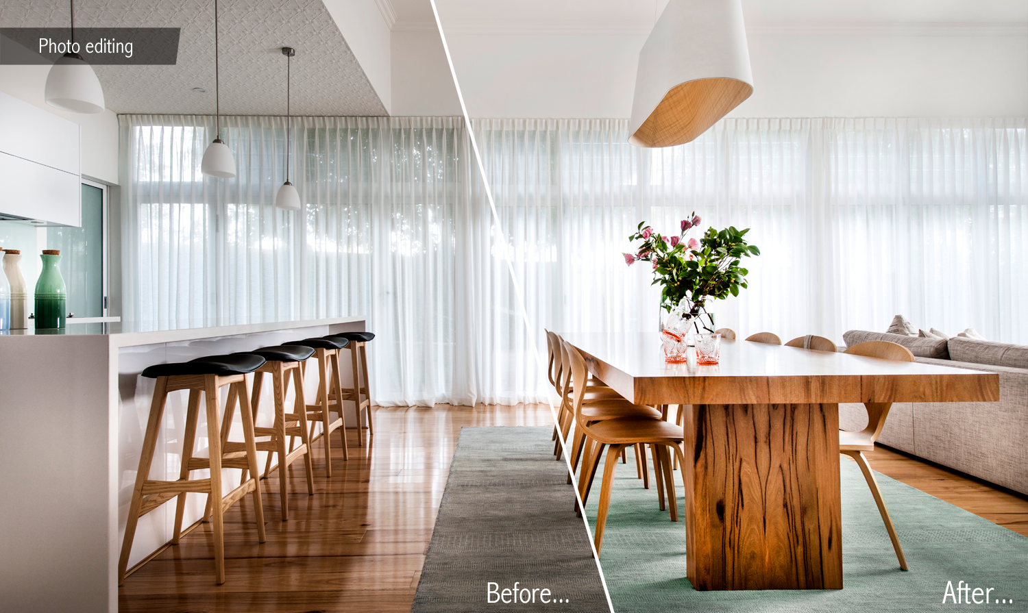
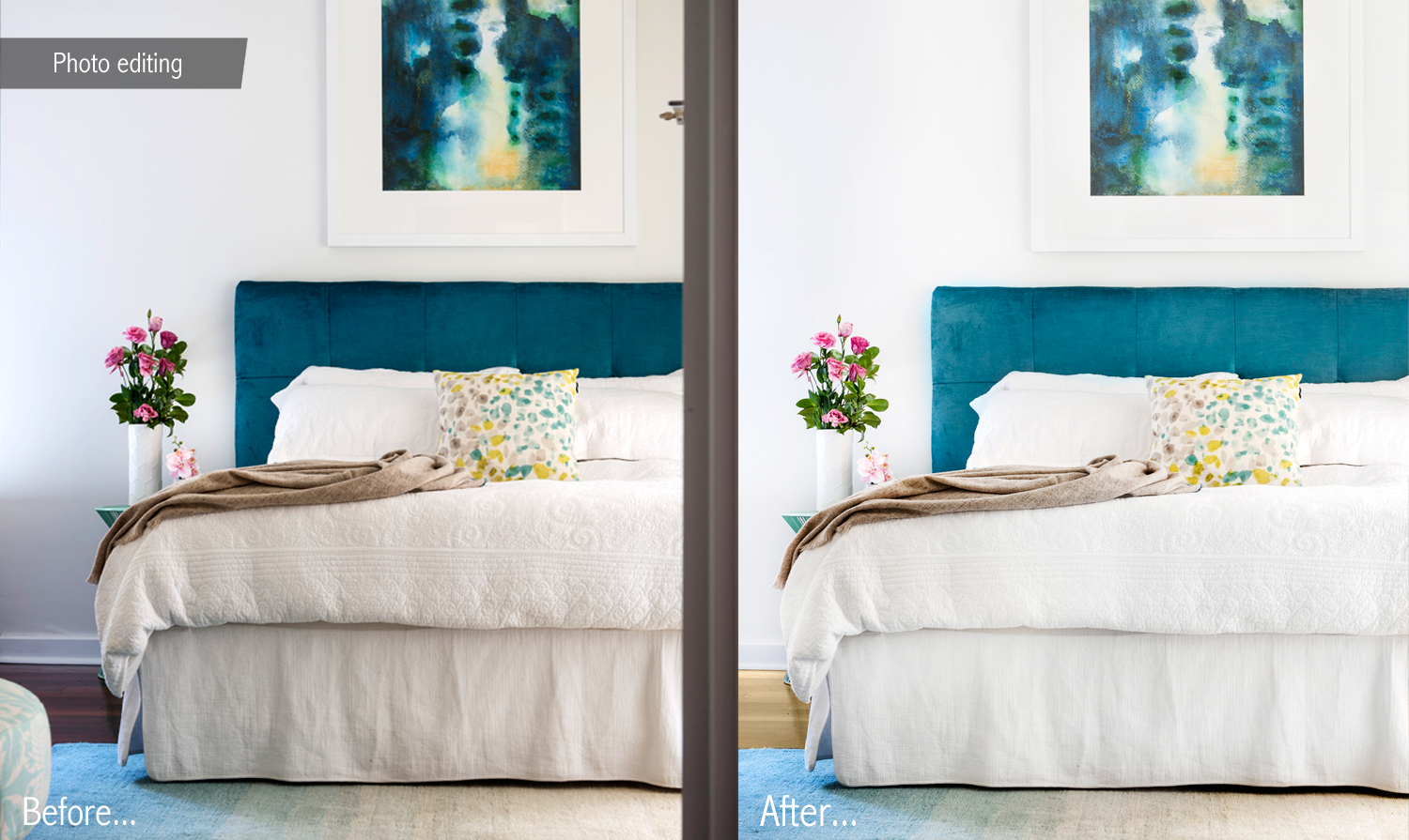
Every image was edited to achieve the perfect lighting in each interior space, and carefully selected so that the internal pages could flow from one to the other keeping a consistent feel across the entire website. Images add a sense of tranquility to make the visitor want to stay longer on the site.
Link effects were also eased to reinforce that sense of calm aimed to retain visitors and let them visit the site with no rush.
Also see Inside a Designer's Website.
About this project
Project:
- Website and blog design and development
- Art Direction, photo styling and editing
- Social Media Management
- PR and blogging
Client profile: Perth-based interior design company
Industry: Interior Design
“
“Working together was easy and fun. Rosa is an intuitive and highly professional designer, who always figured out how to translate our ideas into a digital experience. ”

