Kids Packaging Design With Oh Flossy
Oh Flossy Mini Make-up Boxes
When Oh Flossy decided to take on a full brand transformation they put the packaging at the top of their list. Their existing play make-up boxes had been designed a few years ago and didn't match the new brand identity that the company had recently launched - also designed in this studio, and featured in my portfolio
The revamping of the existing packaging came with a clear brief to create attractive and engaging designs that capture the attention of children as well as their parents. The project goals were well-defined:
Increasing visibility
The new boxes should make Oh Flossy products stand out on the shelves and catch the attention of children and parents. Better visibility could also help increase brand awareness and make their products more memorable.
Improving perceived value
Oh Flossy wanted to move into more premium and sophisticated packaging to better present their high-quality products, making them more desirable.
Enhancing brand identity
The new packaging designs should be consistent with the new brand's identity, and help reinforce brand recognition, differentiating their products from competitors and communicating the brand's unique attributes.
Improving customer experience
The new box design would also make the product safer to transport, ensuring the goods were kept well-protected during shipping, easier to use for children and also easier to clean, making them reusable for many years to come. This would also impact customer satisfaction and brand loyalty.
Oh Flossy magnetic closure boxes were a game-changer. The range features 5 make-up boxes in gorgeous pastel colours to match their brand palette.
Oh Flossy natural play make-up sets
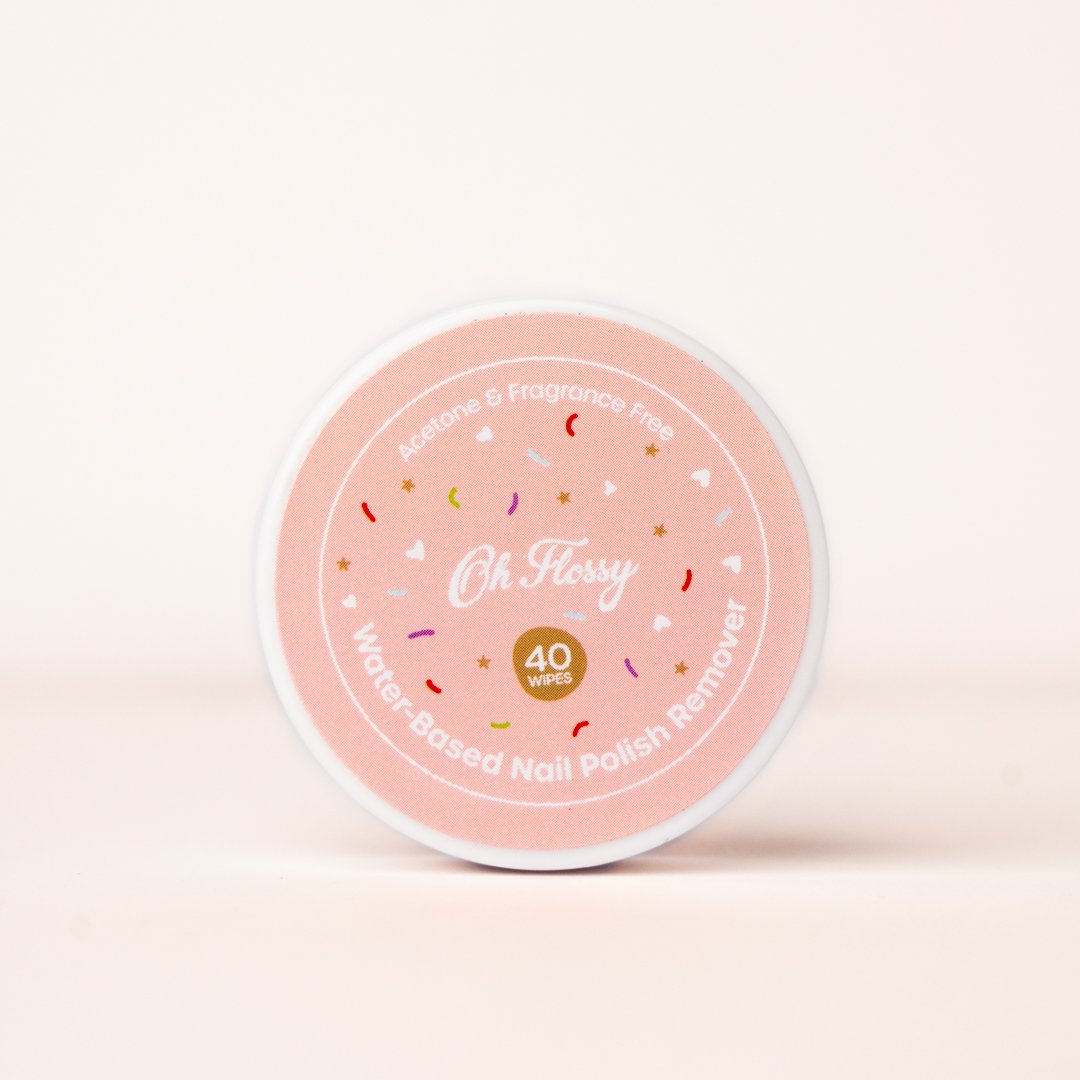
The boxes were illustrated with hand-drawn patterns featuring different themes: make-up, sweets, sparkles, and costumes. Although each box has a different colour and theme, we achieved a coherent look and feel across all the designs by creating a base pattern of colourful sprinkles, white hearts and golden stars that was repeated on each box.
a look at the Pattern design process
A | Base pattern design
B | Sweet treats pattern illustrations
C | Final design combining base pattern and illustrations
The designs were finished off with a fine gold foil print over and an elegant matt embossed texture. Oh Flossy fans can collect the 5 boxes and use them as keepsakes for years, or match their designs with other products in their collection.
After the make-up sets launch, the pattern became a recurring design element in Oh Flossy packaging and stationery, and it would soon make its appearance on many other products of their collection. Here are just a few examples.


