Grafika Projects: Inside A Designer's Website
Project: Art Direction, Photo Editing, UI/UX, Web Design and Development
Date: Launched in September, 2014
I am a big fan of Perth interior designers Collected Interiors, so when I was asked to re-designed their website I immediately felt excited about this project.
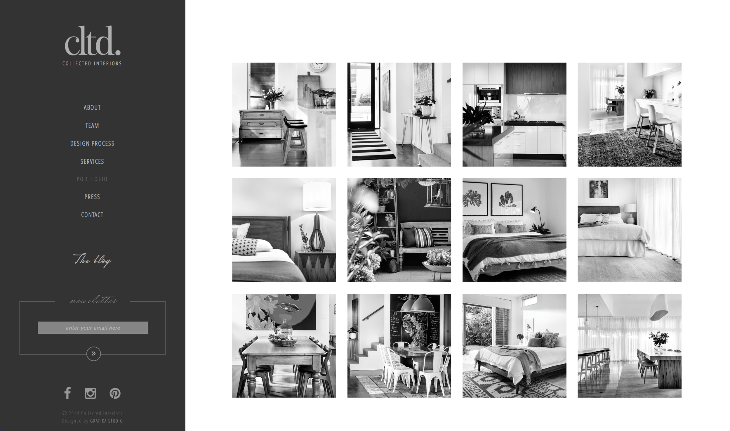
The briefing was to create a sleek and modern new website, to display bigger images and to incorporate some interactive tools.
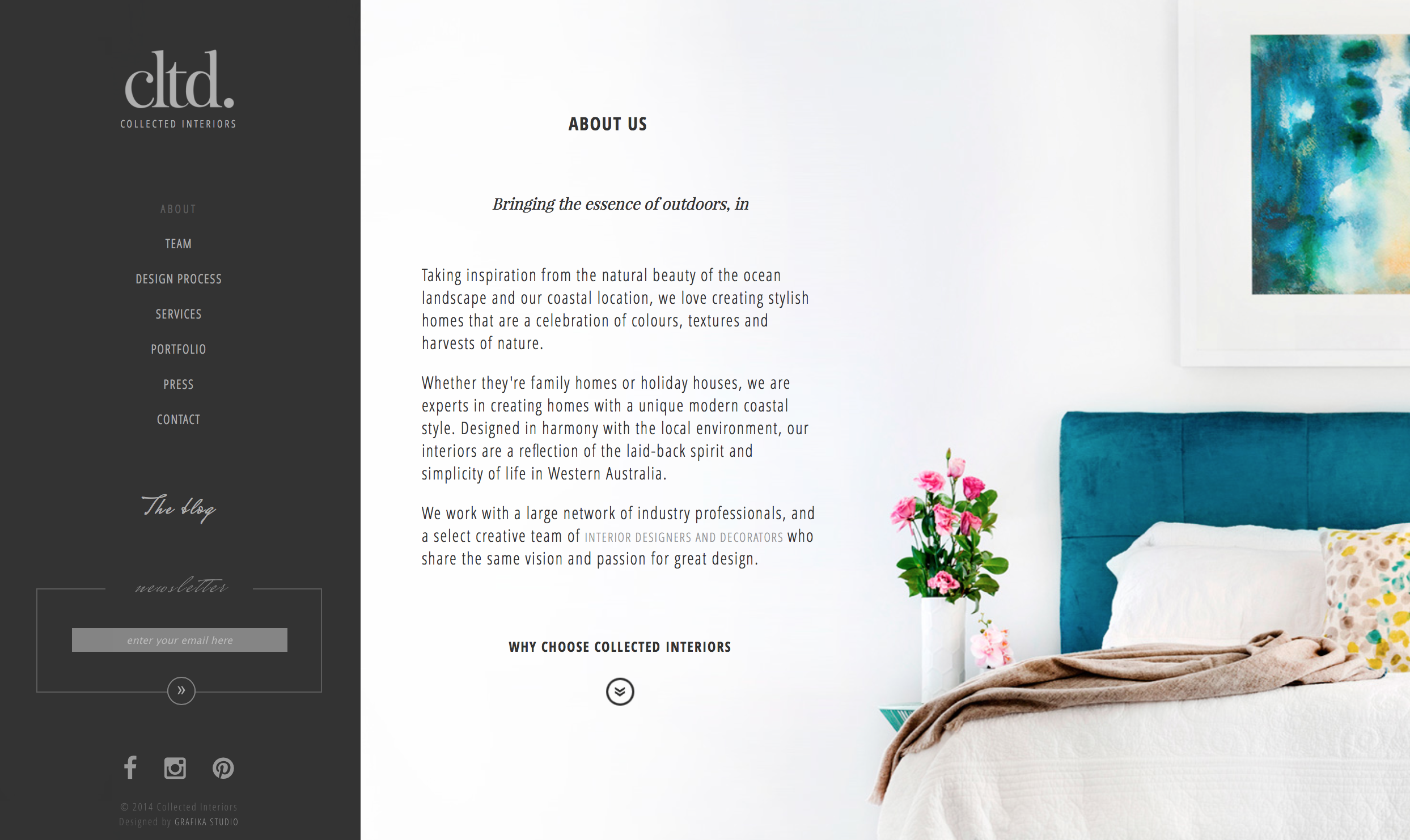
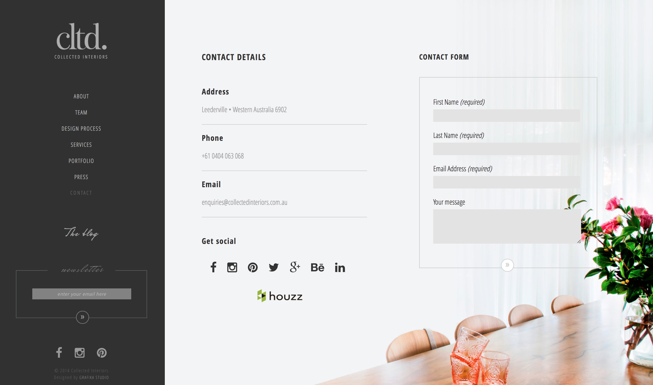
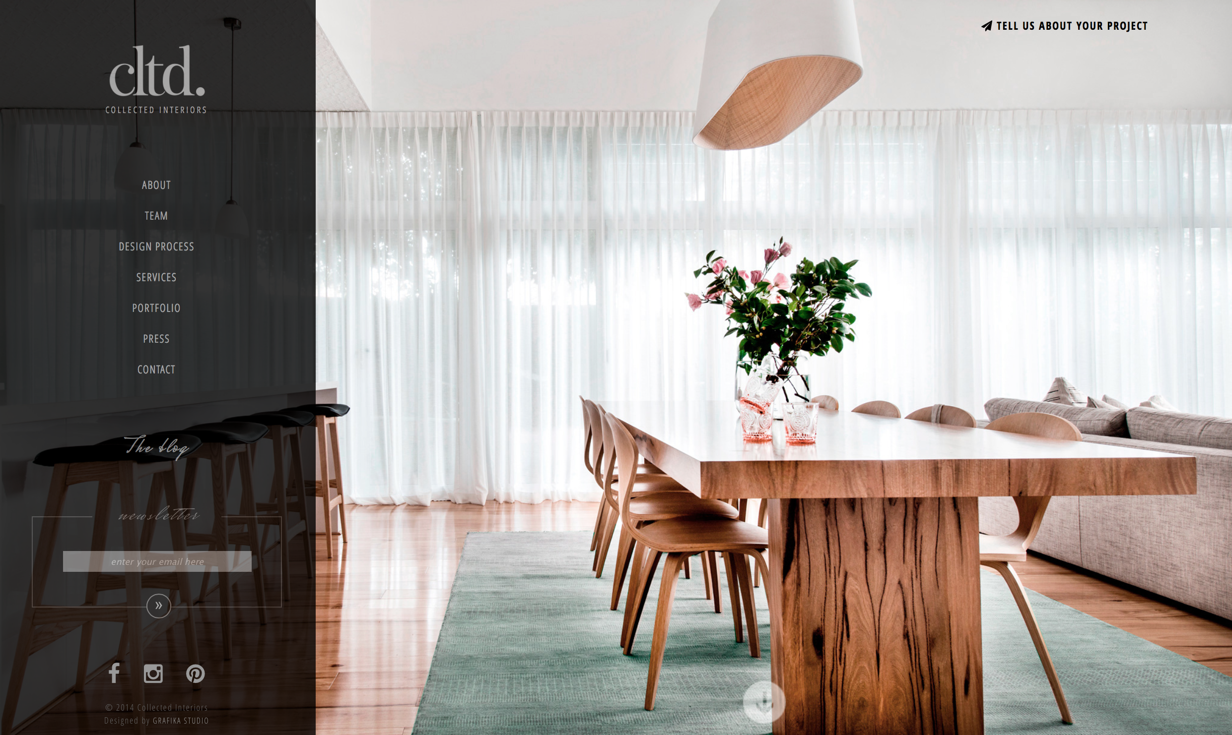
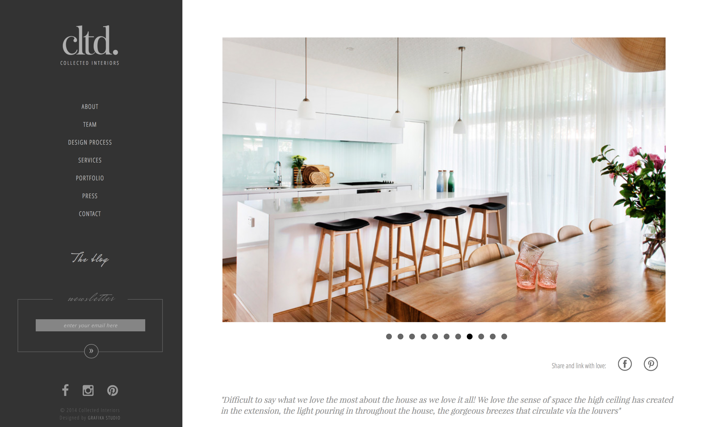
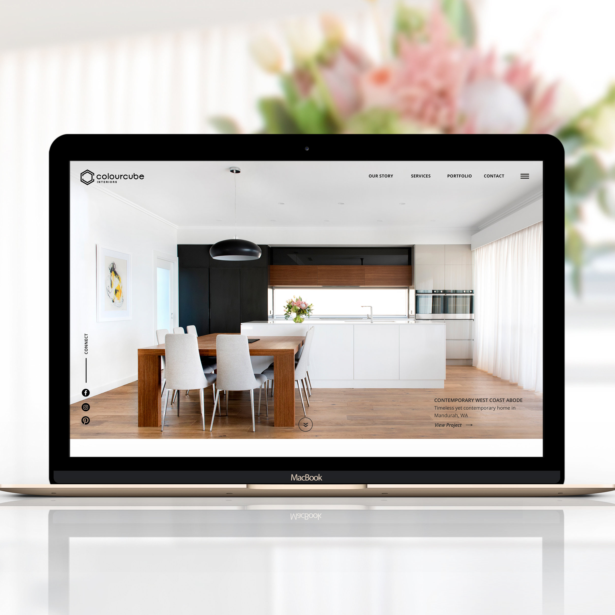
I created a custom-made design – no templates were used here – carefully thought to let the images shine. Full screen images in almost every page allow the visitor to get a taste of the designers' talent before even visiting their portfolio.
The design is simple and clean so that visitors can enjoy the beautiful photographs with no distractions. Condense typography, combined with serif fonts for a classy elegant touch, and a lot of white empty space achieve a modern and professional look & feel.
INSIDE A RESPONSIVE DESIGN
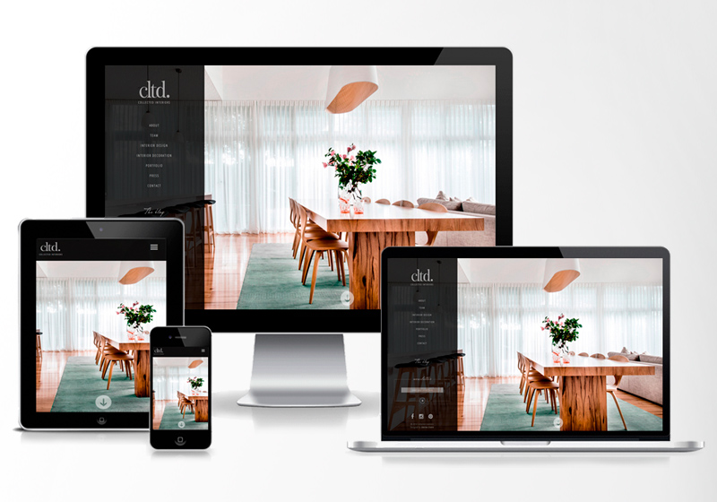
One of the major improvements made on this website was the responsive layout. The full-screen images made a fluid design necessary, so that they could automatically adjust to every screen size without being deformed.
The portfolio pages have a responsive slider with an advanced touch / swipe support built-in to facilitate the navigation from image to image on small devices.
THE USER EXPERIENCE
Every image was edited to achieve the perfect lighting in each interior space, and carefully selected so that the internal pages could flow from one to the other keeping a consistent feel across the entire website.
Every image gives a sense of tranquility to make the visitor want to stay longer on the site. Link effects were also eased to reinforce that sense of calm aimed to retain visitors and let them visit the site with no rush.
THE RESULTS
After the new website was launched Collected Interiors experienced an overwhelming success in social media, getting more than 300 Instagram followers in less than 24hrs, or more than 100 Behance followers in less than 24hrs, and many other successful stories. A SEO friendly website along with a link building strategy put this site at the top of the search engine rankings, busting visits and customer enquires.
“Working together was easy and fun. Rosa is an intuitive and highly professional designer, who always figured out how to translate our ideas into a digital experience. ”
Five simple tips for designer websites
1. Invest in high quality images
Images are the most important piece of marketing for any designer, not just for web design, but also for press, link building strategies, social media marketing and much more. Style your photographs, hire a professional photographer with the right equipment – and experience – to photograph interiors, and edit every image to correct small imperfections and lighting.
2. Keep a simple colour palette
A minimalistic colour palette will achieve an elegant, sleek and modern look in your website. A clean look & feel will let your images speak about your work and the way in which you do business with no distractions.
3. Learn to love the white space
Let the space breathe. Against what many people think, empty space is not a lack of design, it's actually an important design element, essential to achieve a polished and professional look in any website.
4. Apply a visual storytelling to your website
The entire website must tell the visitor your story and every page must conceived as a chapter of that story. The storyline must flow through an intuitive navigation, powerful images and a compelling message. Every aspect of the website design should be carefully and consciously selected to help to support the thread of the story.
5. Create an emotional connection
Design is an emotional business and your prospects will only become clients if they connect emotionally with your brand. The challenge is to create that emotional connection in a few minute visit to your website.
Call to actions will get you newsletter subscribers, blog readers, social media followers, etc, that will stay connected to your business after visiting your website. Use all these platforms to continue working on that emotional connection with them. Many visitors won't get in touch in their first visit but will be ready to work with you after a few interactions with your brand.
Are you interested in working with me for the design of your brand and website? Visit my Branding and Web Design pages for more information on my process, design package and pricing, and my Contact page to get in touch!








The revamping of the Oh Flossy play make-up boxes came with a clear brief to create attractive and engaging packaging designs to capture the attention of children as well as their parents. The project goals were well-defined and the result would delight customers and pour great reviews.