Throughout history, stories have been the most natural way to pass information among humans. Through storytelling, we share knowledge, express emotions and entertain others.
“Stories have always been a primal form of communication…They connect us to a larger self and universal truths.”
While conventional website design commonly uses card-style layouts to organise the information in small units, narrative layouts can also be applied to websites.
In today's post I'll show you how you to create a storytelling website and some common techniques to make it engaging and interactive.
Why a storytelling website?
An effective storytelling website requires a lot of planning and excellent user interface design. But when it’s done right, it can establish a strong emotional connection between the brand and the visitor.
Every website has a story to tell, but not every website needs a storytelling layout. Sometimes a single image is enough to tell your story. Words, colours and other graphic elements also tell stories.
But when the website needs to deliver more complex messages, designers use a combination of two powerful communication tools:
- Visuals
- Storytelling layouts
In web design, storytelling needs to be visual. Visitors find text intimidating; they don’t like to read on the computer screen, so the story needs to be short and told in just a few words.
What makes a good story?
First of all, your story must have a purpose that changes visitors' views or believes, or influence somehow their decisions.
Your story also must engage your audience and encourage them to take some action at the end of it. To achieve this:
- Make them participate in the story. You can achieve this through some of the interactive techniques described below.
- Lead the visitor to a conclusion or a “moral” that makes them take some action. You can achieve this through call-to-actions.
As Jessica Moon says in her post30 Compelling Examples Of Visual Storytelling On The Web “Much like how we expect to see a moral at the end of a book, we expect to find a purpose at the end of a site with a storytelling experience”.
Creating a storytelling website
Every story has three parts or acts: setup, conflict and resolution. You can start by dividing your story into these three acts.
- Identify a hero and a villain.
- Create a setting where the action will take place
- Develop an action that contains a conflict
- Create surprise factor, with perfectly-timed surprises that visually engage and delight the user
- Add a moral or conclusion, and allow readers to think for themselves
- Keep the story short and sweet
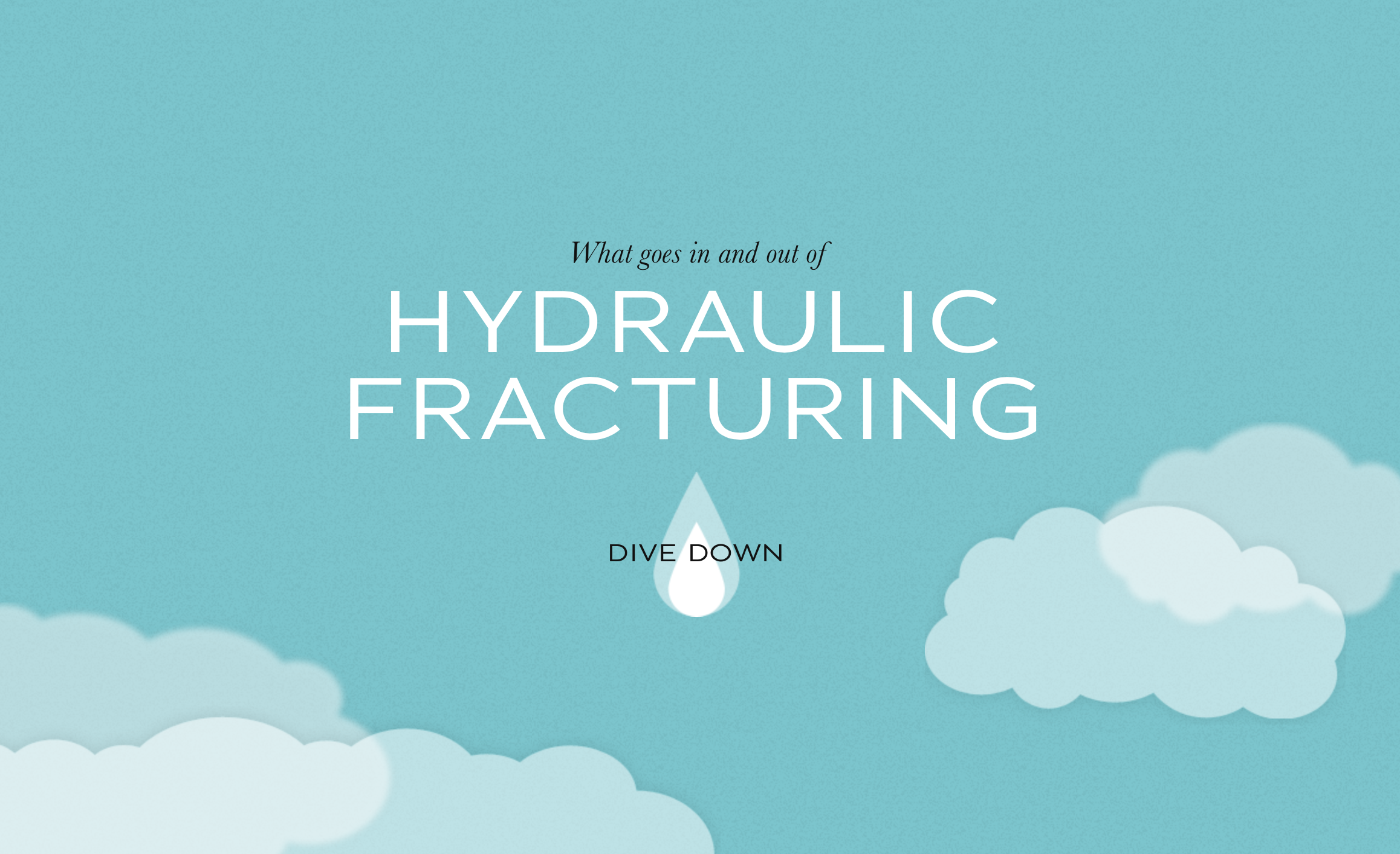
A great example of story telling website is The Dangers Of Fracking. The website propose of the website is explain the concept of hydraulic fracturing.
- Hero: the visitor
- Villain: the hydraulic fracturing
- Setting: sky → city → road → fracking site → pipes → sky
- Conflict: several environmental, safety, and health hazards
- Surprise factor: scroll-triggered effects
- Moral: support the FRAC Act
- CTA: sign up the petition
Website storytelling techniques
1. Long-scrolling website
While long-scrolling websites were something to avoid in web design a few years ago, today, they are the most common layout to tell a linear visual story. They usually combine a long background image with position fixed elements to create a sense of movement when scrolling.
A long-scrolling site can combine a variety of interactive techniques to engage, surprise and make the visitor participate in the story.
Apart from the example above, the hydraulic fracturing website, below are other two great examples of long-scrolling storytelling websites:
Example 1 | Vertical scrolling: Babel The King
Babel, the story main character, falls down from a cloud to the grass as you scroll down. I love the cute illustrations of this website, designed by its own author karim Maaloul, a Belgiam creative director and founder of interactive agency EPIC.
Example 2 | Horizontal Scrolling: The Bright Future Of Car Sharing
A drive in a virtual car shows the social, economical and environmental benefits of sharing a car ride. The website has been designed as a big interactive infographic, with lot of information and data presented in a visual way.
2. Scroll-triggered animations
The information makes its entrance from the sides or the bottom of the screen when scrolling down, throw subtle animations. This technique gives front-end developers the ability to create richer and more interactive web experiences.
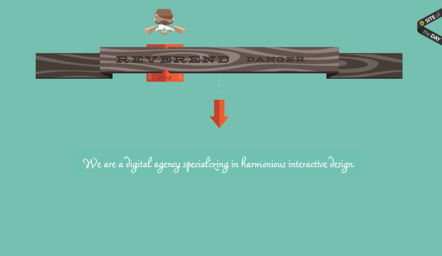
Example 1: Reverend Danger
This digital agency explains their creative process through a clever interactive design.
3. Parallax scrolling
When the background images move slower (or remain static) than images in the foreground, creating the illusion of depth and immersion.
Although the parallax scrolling is growing in popularity across the Internet, the main problem of this technique is that not responsive and mobile-friendly.
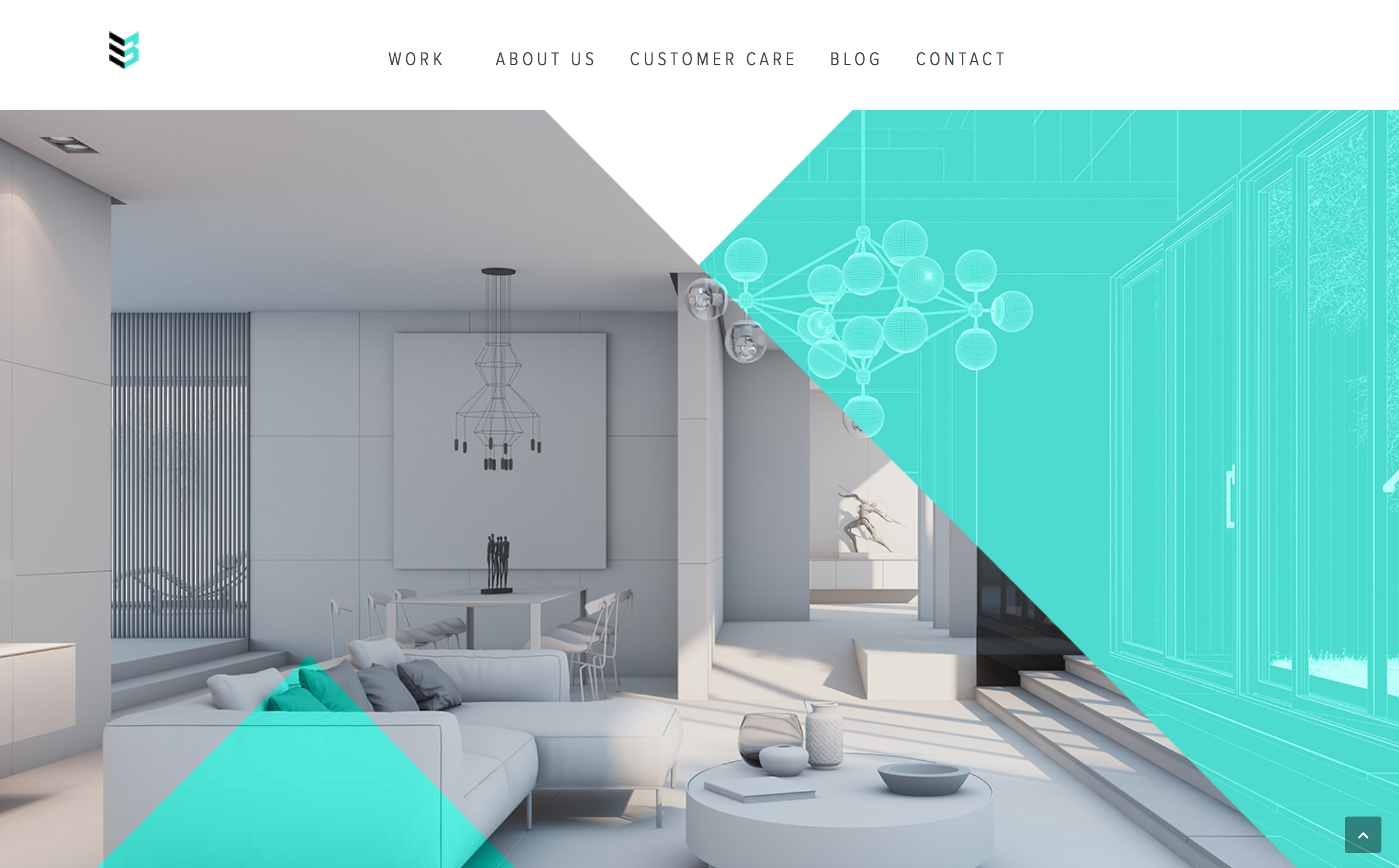
Example 1: Case 3D
In this website the parallax scrolling has a clear purpose: it shows the transformation from sketches to amazing 3D visualisations.
Example 2: Beoplay
An excellent example of how sounds can also play an important role in storytelling websites. As you scroll down the sound gets louder as if it's slowly approaching to the visitor. The sound here is used to create a tridimensional illusion where elements can get closer or further in the distance. Open a new window browser on top of this website and see what happens...
4. Hover-to-reveal copy
If the website contains a lot of copywriting, the visitor will find the site too overwhelming and abandon it quickly. Hover effects are a clever way to hide some of the content making the site easy to scan. When you mouse over an element, other pieces of information are revealed.
This way to present the information is very interactive. The visitor explores the site searching for hidden content.
Example: Evoenergy
A great storytelling example with ecological message. Information is displayed as you hover over the different elements of the graphic, creating a very playful and engaging experience for the visitor.
Takeaway
A good storytelling website is a powerful communication tool that when is done correctly can:
- Explain complex concepts or ideas in a simple way, easy to understand by the audience
- Create an emotional connection with the visitors
- Make the content more engaging and visually appealing
- Provoke curiosity and encourage people to navigate through the entire page.
- Persuade the visitor to take action in a more effective way









The revamping of the Oh Flossy play make-up boxes came with a clear brief to create attractive and engaging packaging designs to capture the attention of children as well as their parents. The project goals were well-defined and the result would delight customers and pour great reviews.